Hanging Gardens
Case Study
Digital Menu for a Modern Restaurant
Project Overview
The Product:
This website is a digital menu for a modern restaurant. It has been crafted with an eye at reducing the need for endless scrolling.
It’s other main feature is that each item has a drink pairing and a picture so restaurant patrons can see what the food looks like without having to find one on the internet
Project Duration:
January, 2022 - February, 2022
The Problem:
Long lists and a lack of pictures plague most web-based digital menus these days. It becomes frustrating to search through a seemingly-endless page to find something you want. With the rising cost of restaurant food, when you do finally find something appetizing, you have to rummage around the internet for a picture or else you could end up with a lemon.
The Goal:
To start a revoluation in the way digital menus are designed, starting with the elimination of extended scrolling, adding pictures and giving users more information on the way the menu items are prepared.
My Role:
UX Researcher, Designer, Usability Tester
My Contributions:
Creating User Profiles and Journey Maps, Paper and Digital Wireframing, Low- and High-Fidelity Prototyping, Conducting Usability Testing and iterating on the results

Understanding The User
• User Research • Personas • Problem Statements • User Journey Maps
User Research
Summary
Research methods consisted of live interviews with two participants and an online questionnaire of the same questions sent to seven others. The questions focused on participants’ frustrations with web-based menus.
Most testers said they were tired of menus with ceaseless scrolling to view different sections. They also reported wanting an inclusion of pictures to accompany the menu items.
The inclusion of pictures was an interesting find for me, because I had assumed that pictures would clash with the modern aesthetic. However, usability testers shared their appreciation for the visual description accompanying the text in later rounds of testing.
Pain Points
Dearth of Pictures
Most users said they get frustrated with the lack of pictures, and want to see what dishes look like to get an idea before ordering
Navigation
Users mentioned that they abhor the constant scrolling prevalent in most digital menus.
Nutritional Info
Users said they wanted to know what the nutritional value of their meals were, which is something missing in most menus
Filters
Users showed that they wanted a way to filter out menu items that go against their dietary restrictions so that they can save time while going through a menu
Persona: Harry
Problem Statement:
Harry is an avid restaurant-goer with food allergies who needs to know whether menus abide by his restrictions because he could end up in the hospital if he ingests the wrong food
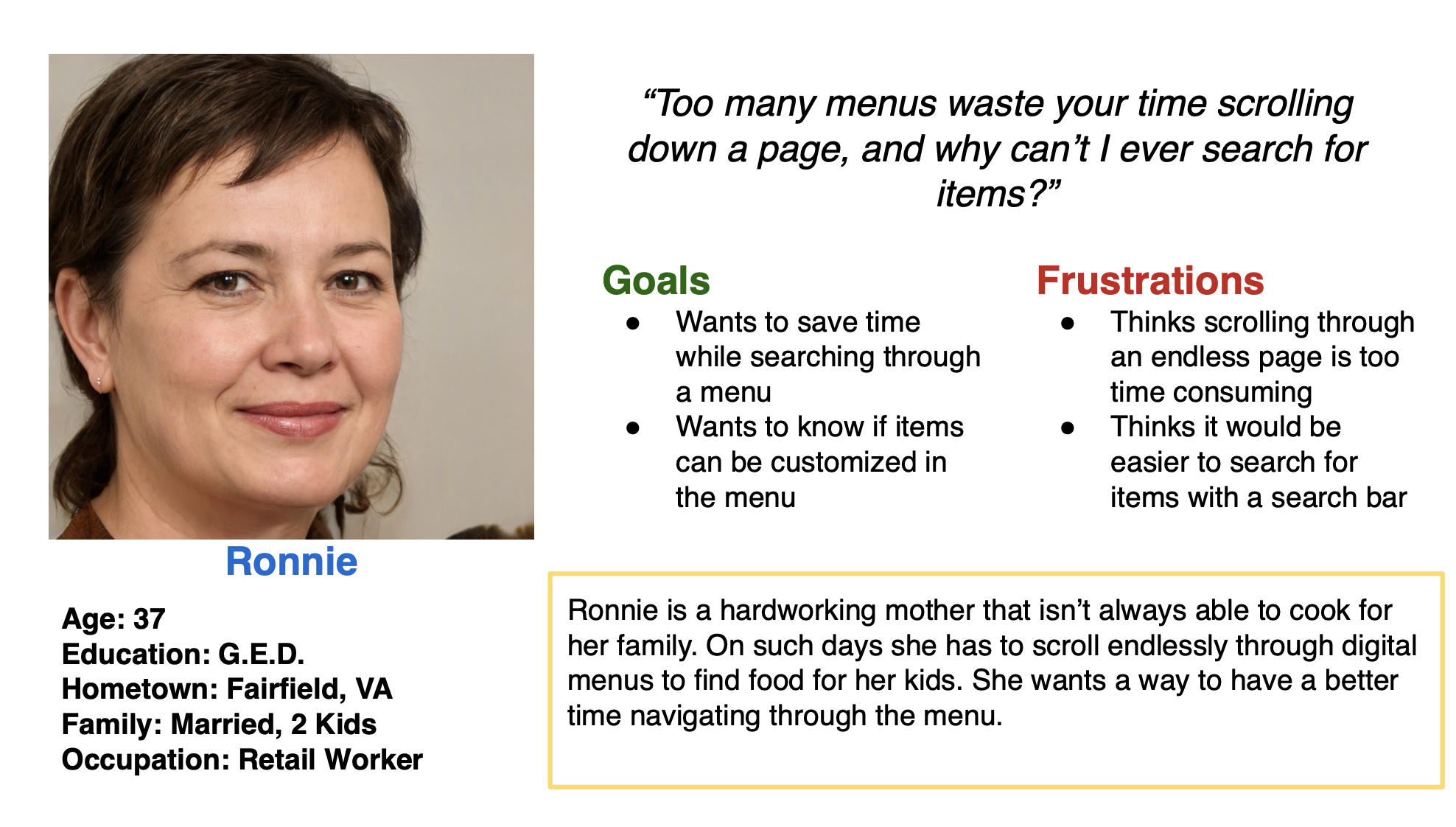
Persona: Ronnie
Problem Statement:
Ronnie is a busy mother working full-time who needs quicker navigation through digital menus because she loses too much time scrolling through menus
User Journey Map
For a person who has to pay attention to menu items and ingredients, Harry would undoubtedly use the filters to weed out any options that would not be amenable with his diet.

Starting The Design
• Paper Wireframes • Digital Wireframes • Low-Fidelity Prototype • Usability Studies
Paper Wireframes
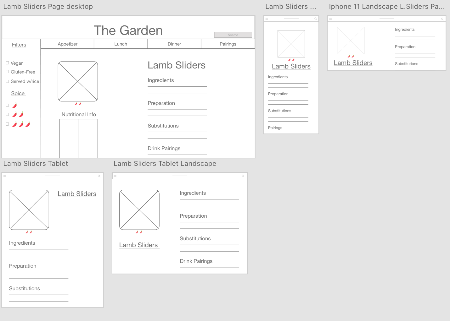
After settling on a desktop design, I decided to see how it would translate onto mobile and tablet versions.
For the “Menu” pages, I had to omit the descriptions and leave just a picture with the name of the dish.
Digital Wireframes
For the Item Info pages, I thought it would be best to include the ingredients in that item and the way it is prepared. Users also reported wanting to see what substitutions can be made for an item.
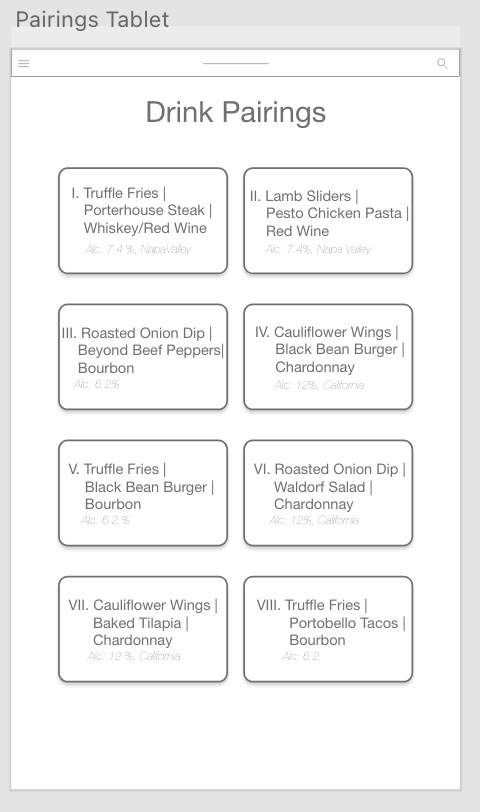
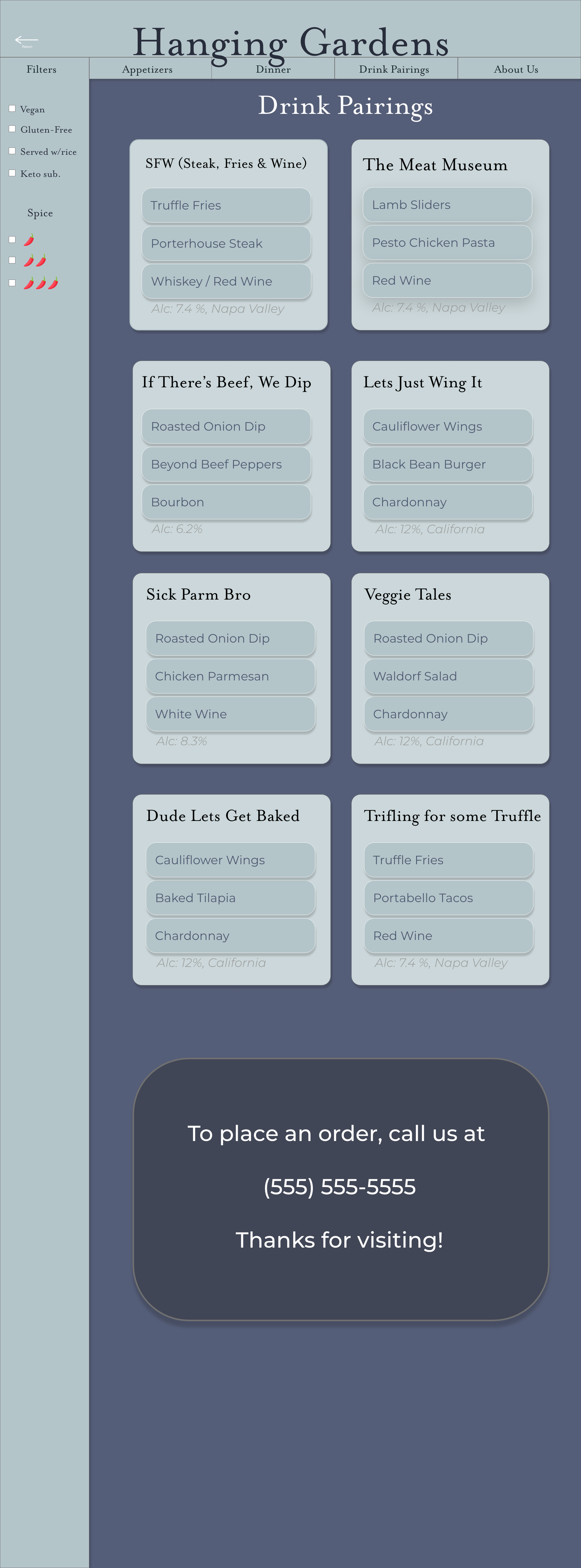
For the Pairings page, I was initially going to list out the items as a traditional menu, but thought the information would look better if it was compartmentalized onto cards.
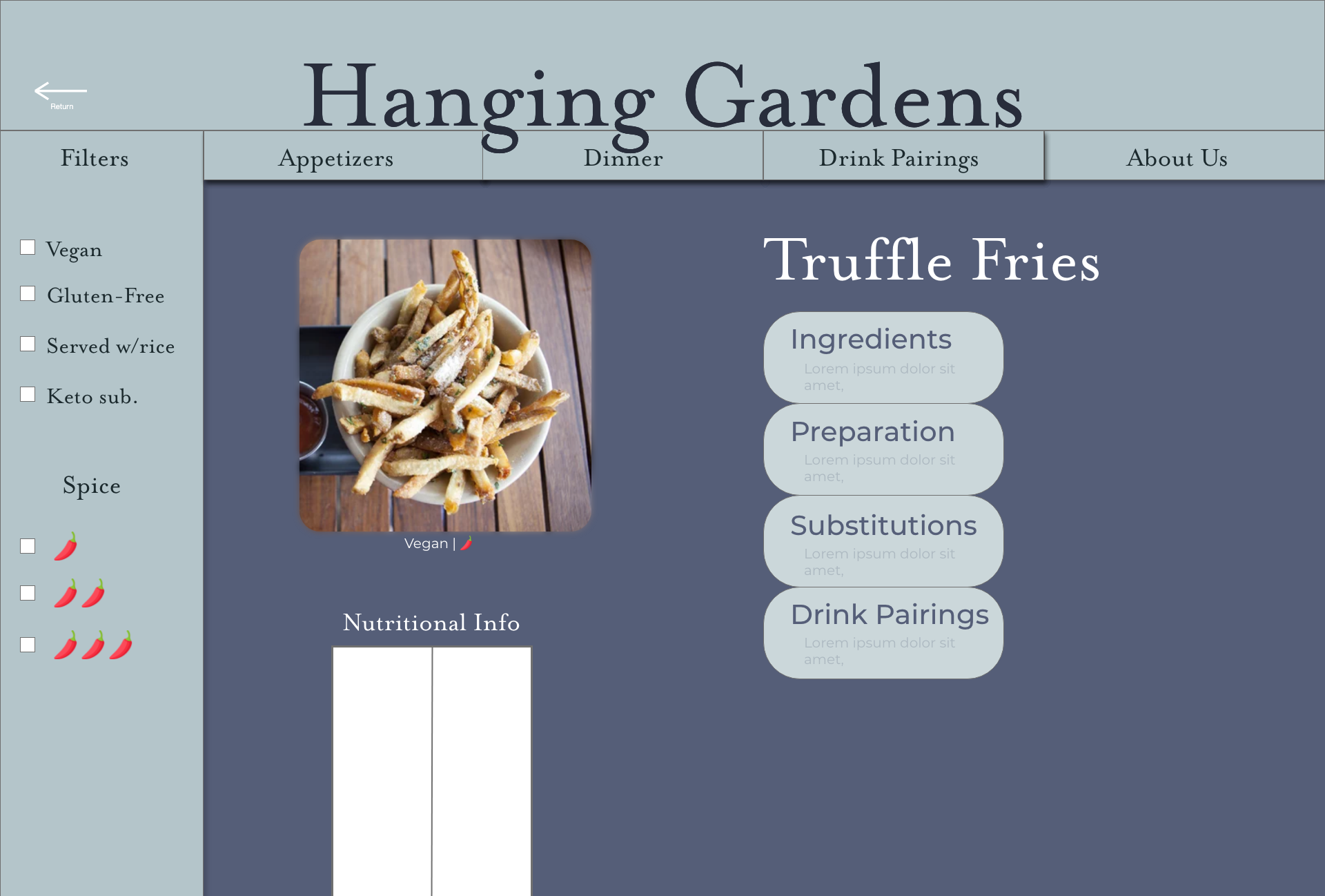
The desktop Menu has a picture of the item as well as a couple of lines of info detailing preparation style and available substitutions
With the mobile and tablet versions of the Menu pages, I thought the pages would look better with just a picture and the items’ name. I also decided to include the spice level and what dietary restrictions the entree abides by.
Usability Study: Findings
Round 1. Findings
Item Info Pages were too busy
Having more filters would be more effective than having a search bar
Round 2. Findings
Colors made the page feel “sleepy”
Items listed in the Pairings page should link to that items’ Info Page
The borders on pictures were jarring

Refining The Design
• Mockups • High-Fidelity Prototype • Accessibility Considerations
Mockups
The second round of usability testing showed that users felt the old layout had too many dark tones and people said it made them feel sleepy. I tackled this issue by changing the secondary colors to something lighter and more in line with the restaurants name.
I knew I wanted the individual items to be their own buttons that link to their Info Pages, it just took some trial and error to figure out how best to display that information. I went back to my paper wireframe idea of having cards to separate each pairing and this time put each item into its own button.
Accessibility Considerations
1.
Changed text colors to be WCAG compliant. Initial text colors were a few shades too light and were a little hard to read with the background color
2.
The purpose of each link can be deduced by the text in the link. Buttons that lead gto a different page are clearly labeled and straight-forward.
3.
All pages have descriptive and informative titles for people who employ screen readers.

Going Forward
• Takeaways • Next Steps
Takeaways
Impact:
“The colors are soothing and wavy and not having to scroll through a long list makes this menu stand out to me. I also like that you had a page with item pairings” - one of the final round usability testers
What I Learned:
I learned a lot about what it takes to create a menu, not just design-wise, but choosing items that pair together and fit the restaurants theme. I also learned a lot about responsive web design, how to reconfigure pages for smaller screen sizes.
Next Steps
1.
Adding more nutritional info to the items. It’s something that would greatly benefit people that care about what food they put in their body
2.
I would like to add more component state interactions to the desktop version of the menu.
