BIZSTRTR Case Study
An Educational Tool teaching adults how to start a business
Project Overview
The Product:
The app and website are tools to help adults learn how to start their own business. there will be an emphasis on marketing help as well as tax info and finding a mentor.
Project Duration:
March, 2022 - April, 2022
The Problem:
Websites that provide information with starting a business usually only focus on a couple of things, with most of the information scattered across the internet.
The Goal:
My goal with this project was to create an app/website that would give users a broader, more extensive range of information to help adults learn how to start a business. I wanted to add more than just a pre-incorporation checklist, something that people can really benefit from.
My Role:
UX Researcher, Designer, Usability Tester
My Contributions:
Creating User Profiles and Journey Maps, Paper and Digital Wireframing, Low- and High-Fidelity Prototyping, Conducting Usability Testing and iterating on the results

Understanding The User
• User Research • Personas • Problem Statements • User Journey Maps
User Research
Summary
Research was conducted using in-person and telephone interviews as well as sending a Google Form to those participants who were unable to interview in person.
Participants were both male and female, and all of them have started a business in the United States. The participants ranged from 25-40 years in age with a sample size of 6. Questions included what their frustrations were as well as asking about resources used by participants.
Pain Points
Not Enough Marketing Info
Marketing plays a big role in a startup, and it can be daunting to most, given the scarcity of basic marketing info.
Sites Don’t Tell You How To Close A Sale
Most sites that provide info on starting a business leave out crucial info such as closing on deals.
Info On Finding A Mentor Is Scattered
It’s hard to find good information on finding a mentor and how to be a good mentee.
Lack of Tax Information
Finding all the right information on taxes can be a frightening adventure, that is either abstruse or located across the depths of the internet.
Persona: Enya
Problem Statement:
Enya is a young entrepreneur who needs a website that can help her find a mentor because she knows that she will thrive with the guidance of someone in the industry.
Persona: Rebecca
Problem Statement:
Rebecca is a working wife with a low-end job who needs an app that can help her learn tax info because it is the one aspect of starting a business that is holding her back.
Persona: Dave
Problem Statement:
Dave is a busy dad that lacks a higher education who needs a tool that can explain basic marketing because he knows that no business is successful without good marketing strategies.
User Journey Maps
Enya wants to find a mentor so she has someone to guide her, but she doesn’t know how to go about getting started. She opens the app and navigates to the Mentor tab and then peruses the tips, suggestions and links provided.
Some changes were made in the end, and Accounting turned into Taxes, but the journey was still the same. Rebecca would open the app, go to Taxes and read through the sections in the page. As important as accounting is, knowing about taxes before launching a business would be more useful in my opinion.

Starting The Design
• Paper Wireframes • Digital Wireframes • Low-Fidelity Prototype • Usability Studies
Paper Wireframes
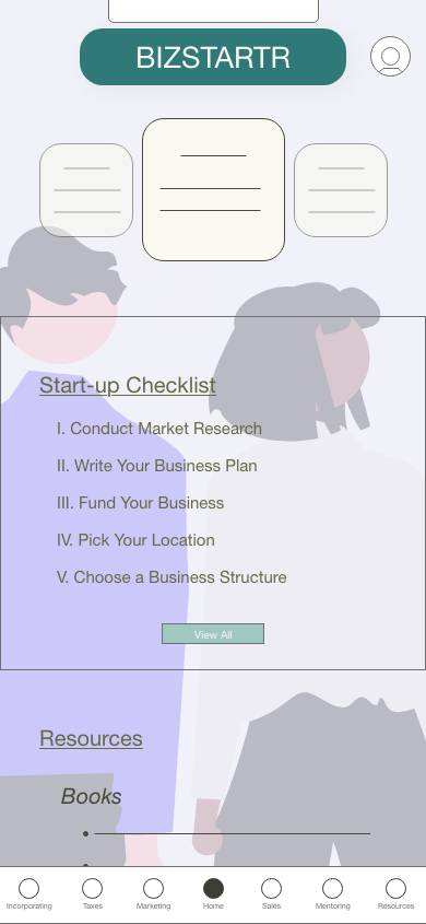
For the Home page, I liked the idea of having a carousel of saved tips at the top. For the other features on the homepage, I thought having a pre-incorporation checklist would be a good benefit to users.
Digital Wireframes
I wanted the first section of the Incorporating page to have a brief summary of the business plan that expands to full state upon tapping.
I thought it would be best if, in the Marketing page, there was a page of your saved strategies. This page later became “All Strategies” instead of “Saved Strategies”.
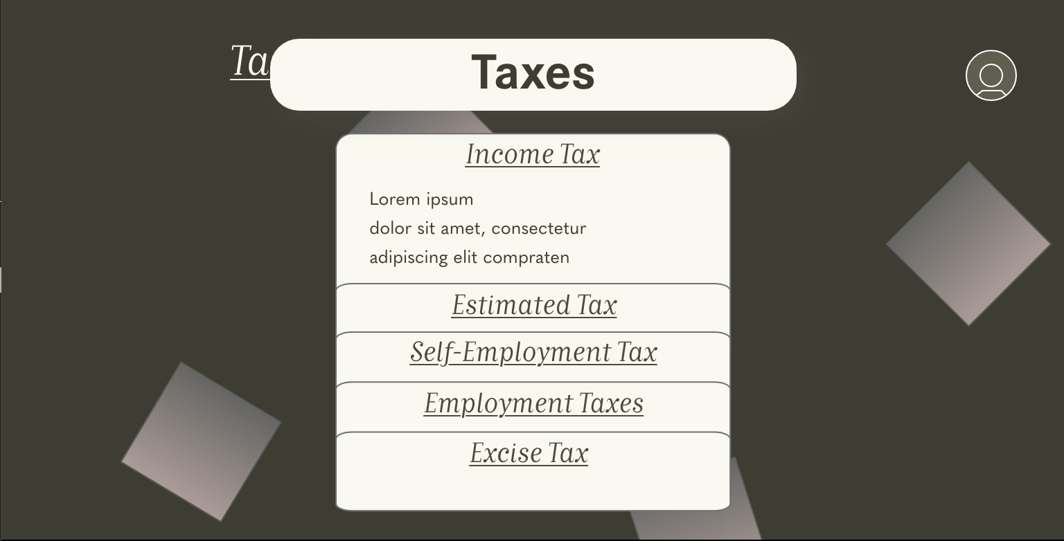
In Taxes, I included the things that I deemed to be the basics after some extensive research.
Low-Fidelity Prototype
Usability Study: Findings
Round 1. Findings
Strategies should have a quick save button
Scrolling title needs a box around it
Dropdown menu titles should be reworded
Round 2. Findings
Color scheme needs to be changed
Pages look too bare

Refining The Design
• Mockups • High-Fidelity Prototype • Accessibility Considerations
Mockups
Usability Testing showed that users found the old screen too busy and the colors too varied for an enjoyable experience. In response, I stuck to my dark mode screens and created a simple background with shapes to fill up the screen.
A change of color scheme and adding a semi-transparent background put more focus on where the users’ attention should be.


Accessibility Considerations
1.
Made sure the color contrast met WCAG accessibility standards
2.
The purpose of each link can be deduced by the text in the link. Buttons that lead gto a different page are clearly labeled and straight-forward.
3.
Had clear headings for subsections for screen readers to detect.

Going Forward
• Takeaways • Next Steps
Takeaways
Impact:
A couple usability testers said that they would have loved to have an app like this when they were starting their businesses. Other testers said that the design was “sleek” and an enjoyable experience.
What I Learned:
In addition to learning a lot about the process of starting a business, I learned how to effectively create component states and how to create the connections properly. I also learned that adding simple shapes with low transparency can make page feel less barren.
Next Steps
1.
One step I would like to take is the addition to search for info or articles in-app.
2.
Another step would be to include a map-search function to search for mentors or accountants in your area.


