
What You Got
Inventory Management App Case Study

Project Overview

Adding a recipe
The Product:
An inventory app for people of all professions and technical skill levels. it features analytics on item usage as well as the ability to create custom lists and add expiration so items don’t spoil. Target users are those that want to manage and track inventory of cooking ingredients.
Duration:
September 2021 - January 2022
The Problem:
Many inventory apps these days are overloaded with features that can get confusing to the technologically incompetent portion of the population.
The Goal:
To create an inventory app with the most basic features as well as giving users the ability to mark expiration dates so they can reduce their food waste.
My Contribution
My Role:
Researcher, Designer, Usability Test Conductor
Responsibilities:
Foundational Research, Conducting Interviews, User Research, Wireframing, Prototyping, Mockups and Usability Testing

Understanding The User
• User Research • Personas • Problem Statements • User Journey Maps
User Research
Summary
Research methods conducted include user interviews with six participants as well as extensively using the competitions products to get a better understanding of the how app should work and to establish a baseline of standard features.
Of the interviewed participants, two were professionals in the food industry with prior knowledge of managing restaurant inventories. Other participants have had experience managing inventories in different industries.
Personal assumptions prior to conducting research were that inventory analytics would not be important to most people. another assumption was that people would want a tab to create recipes and see how much inventory they have.
Pain Points
Too Many Features
Users said that most inventory apps on the market have many features that users didn’t need and found cumbersome.
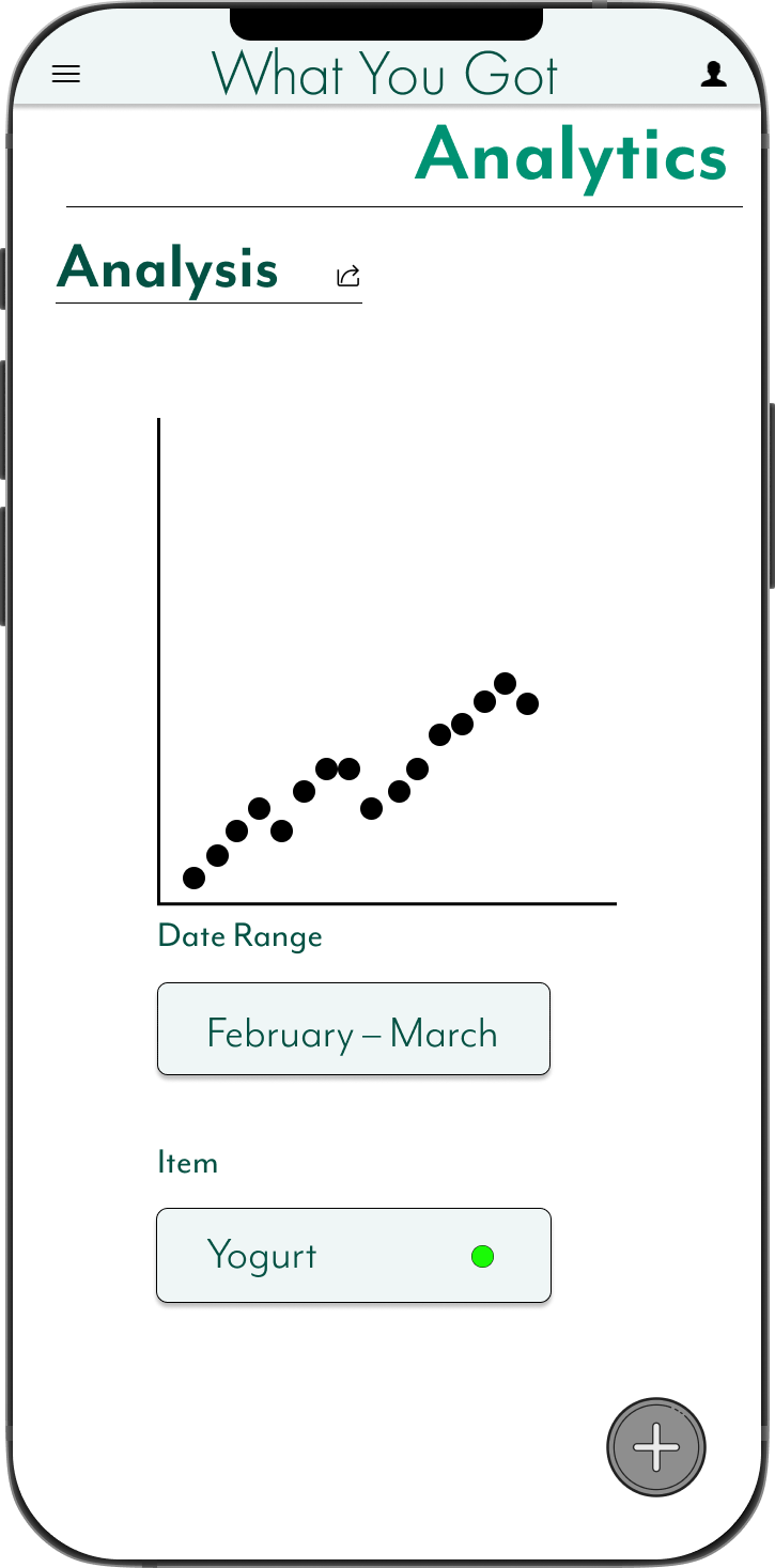
Lack of Analytics
Most inventory apps don’t provide enough analytics options for users to really track their inventory usage.
Persona: Tony
Tony is a Bakery Manager who needs to view inventory analytics because he needs to know what items run out the most

Persona: Michelle
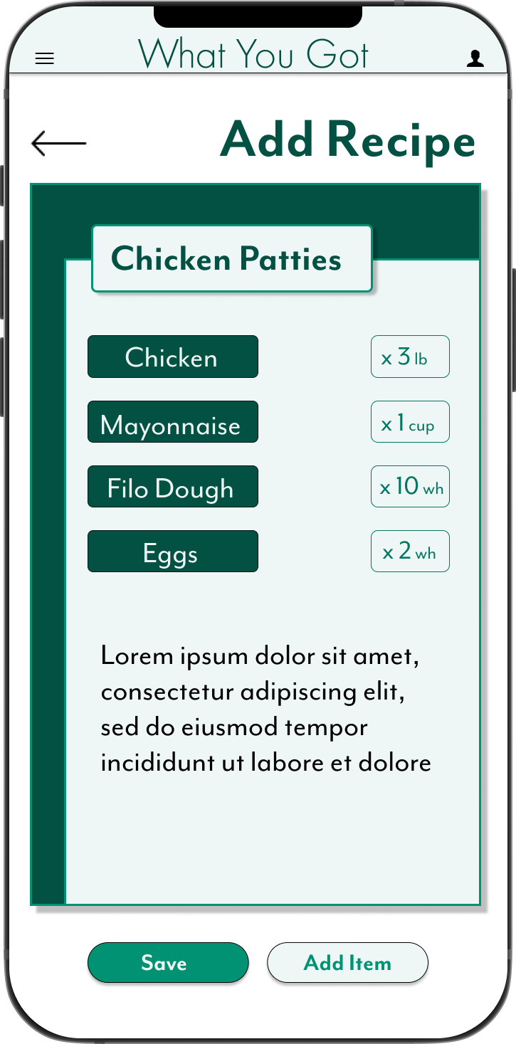
Michelle is a Personal Chef who needs to be able to create her own recipe’s in-app because her clients have allergies that require different ingredients

User Journey Map
The flow I wanted to simulate was creating and sharing a list. In the process, Michelle downloads and opens the app for the first time, from there she navigates to the Lists page and clicks the button to create a new list. From there she shares the list with other stakeholders.


Starting The Design
• Paper Wireframes • Digital Wireframes • Low-Fidelity Prototype • Usability Studies
Paper Wireframes
I wanted the home screen to display the most critical information, chief among them being what items are out of stock. I toyed with having Analytics and Lists alongside the low stock.


Digital Wireframes
I wanted the home screen to display the most critical information, chief among them being what items are out of stock. I toyed with having Analytics and Lists alongside the low stock.

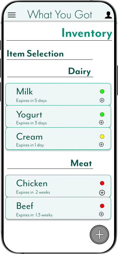
I knew I need to add location and expiration to the items’ info because that data is crucial for users to know where things are kept, and also know when things go bad so they don’t hold off on using them.


Usability Study: Findings
Round 1.
Users want to add items to lists from the Inventory overview page
Users will have a smoother experience with an introductory tutorial
Users want to know where their items are sourced from
Round 2.
Users think the colors could be more harmonious
Users would like to have a database of grocery items they can select from
Users want the app name in the header to link back to the home page
Refining The Design
• Mockups • High-Fidelity Prototype • Accessibility
Mockups

I liked the idea of having to cards with the item info and decided to put a slightly artistic spin on it to try to keep things different

While I liked the layout of the recipe pages, a friend said I should revise my color scheme to something that clashed less. It was a journey picking new colors, but one I’m thankful for.


Accessibility Considerations
1.
Confirmed that the colors were approved for web accessibility
2.
Included settings for different languages due to the sprawling racial diversity of my city
3.
Included an option to switch measurement units between imperial and metric

Going Forward
• Takeaways • Next Steps
Takeaways
Impact:
“I need this app in my life” - from one of my study participants after she saw the options for location and expiration. She mentioned how often she ends up throwing away food because it spoiled because she remembered about it. This is part of the impact I want this app to have.
What I Learned:
I learned a lot about managing food waste and also about color selection and accessibility considerations regarding color. I also learned to notice the side pages and popups that go into apps.
Next Steps
1.
One of the next steps I’d like to take with this project is the addition of a search bar. It will greatly benefit users to be able to search through their inventory instead of having to scroll to find the item they’re looking for.
2.
Another addition I’d like this app to have is a barcode scanner with databases of products. Some users might not know an item by name and it will be easier for them to identify products with a picture.
3.
The last addition I’d like to see with this app is the inclusion of more analysis options. It will be a great boon to users if they have more data about their usage and can also help reduce food waste.