Gilded Coils
Website Redesign and Development
Getting Started
Alifia, a talented hairstylist, educator and founder of Gilded Beauty LLC, already had a website developed but she was looking for an update to bring new life to her digital presence.
As a result, this case study did not require the usual research that I would perform with a project, and only features the wireframes and mockups I created to be used for development.
I also helped straighten out some of her brand motifs such as colors and fonts. She had given a list of colors she liked that I tweaked for better contrast and accessibility. The end palette was comprised of shades of purple to reflect the luxury of her high class of work.
For her fonts, her previous website had used a singular font for all headings, paragraphs and buttons. I decided to add some variety by adding a serif-based font to pair for headings to pair with her original font in paragraphs.
The focus of the website is mainly on her Services and Testimonials with plans to add a portfolio of her work and a membership section in the future. Usability tests will also be conducted to find faults after the website has been launched for a couple of months.
Since I’m also developing her website on Squarespace, I made sure to design her pages with the knowledge of what can be made with the Squarespace engine. It would help no one to design gorgeous pages that ultimately would be unfeasible to create.
Starting The Design
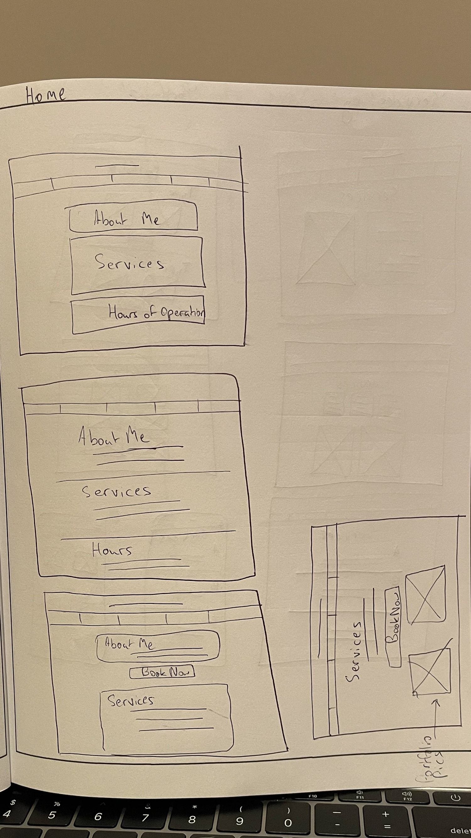
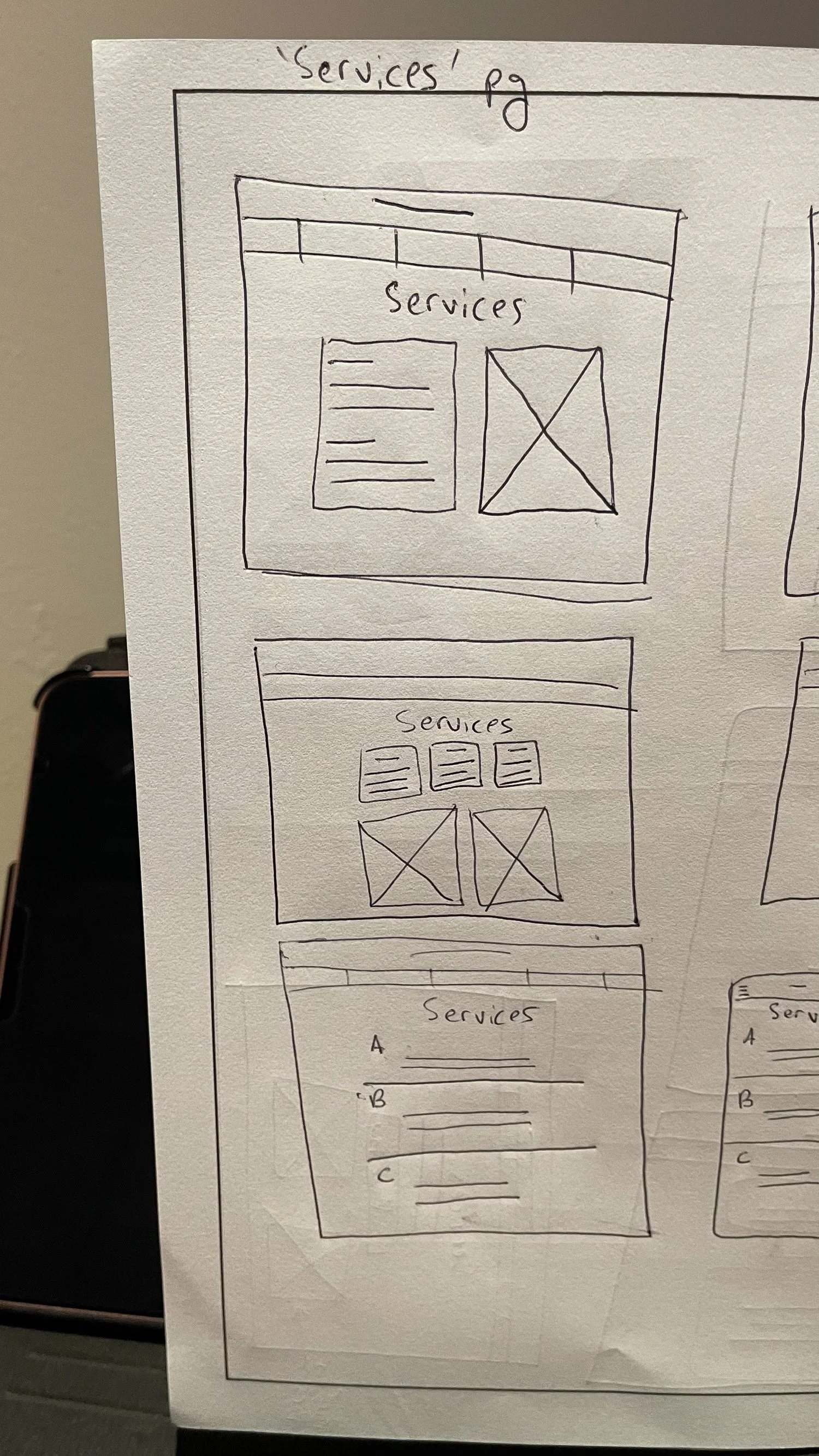
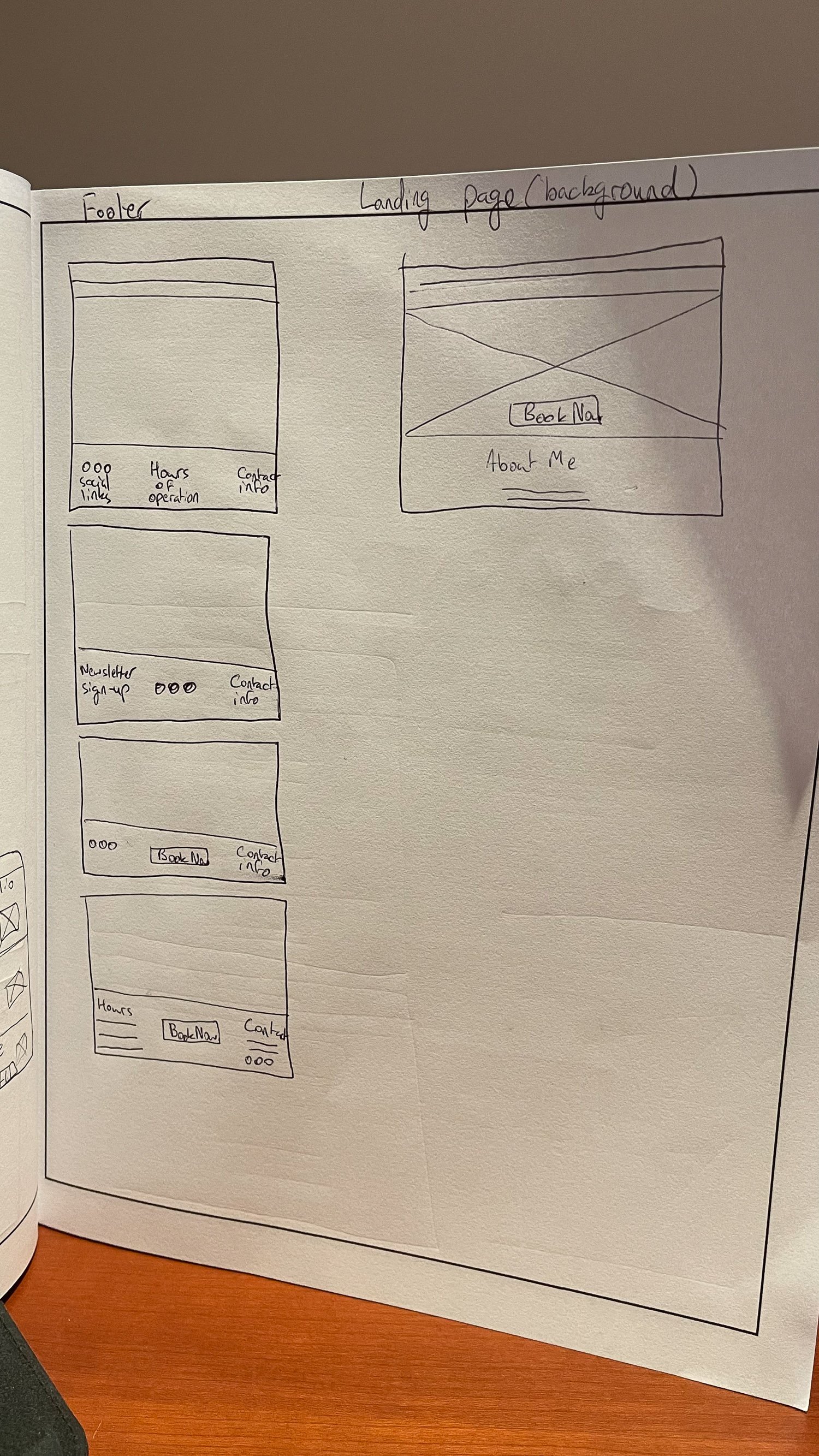
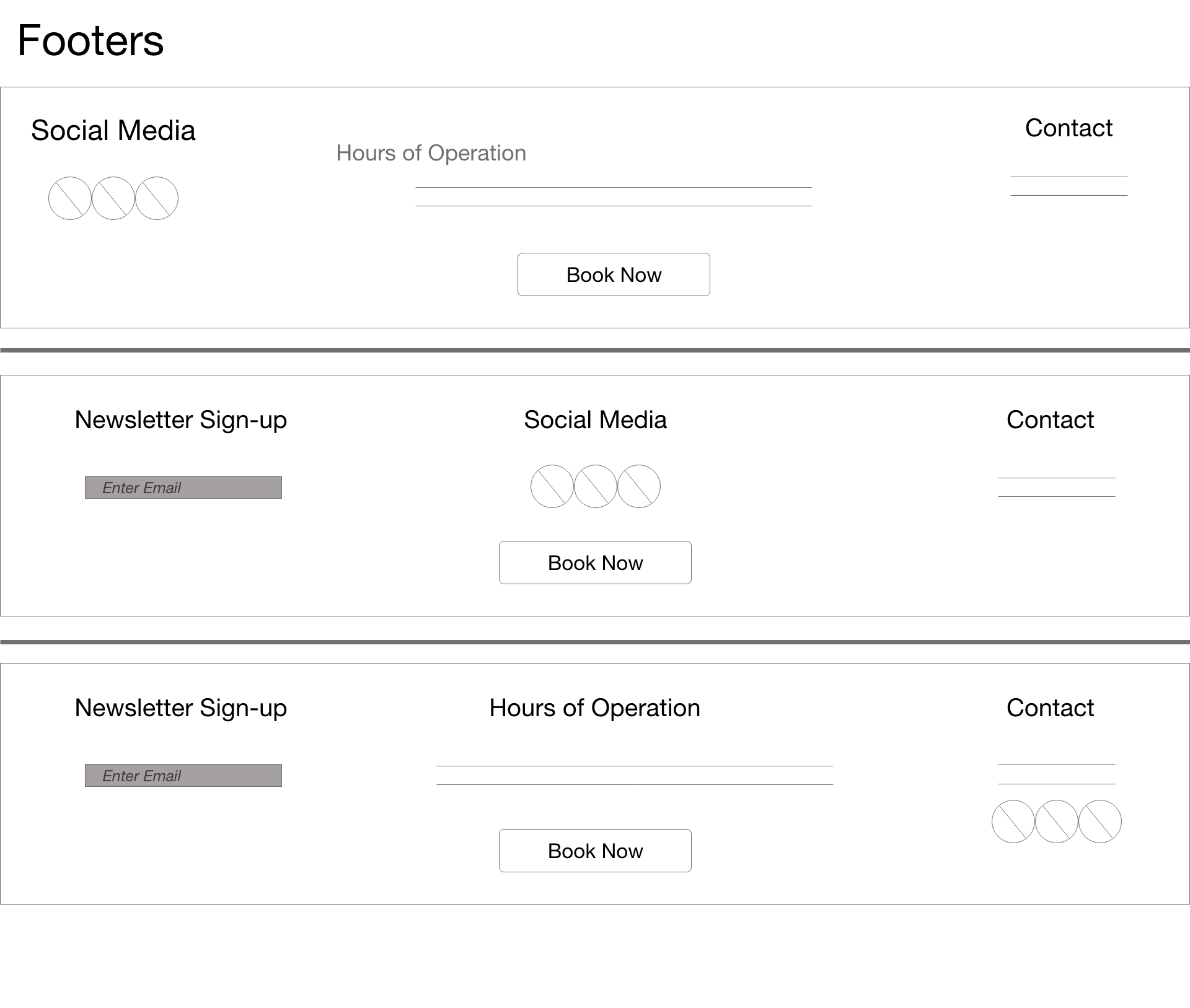
• Paper Wireframes • Digital Wireframes


Building On The Design
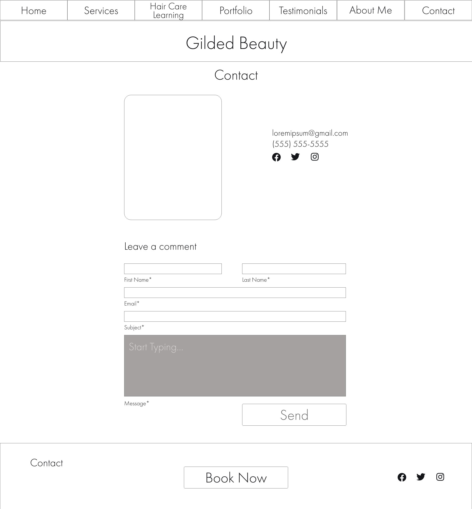
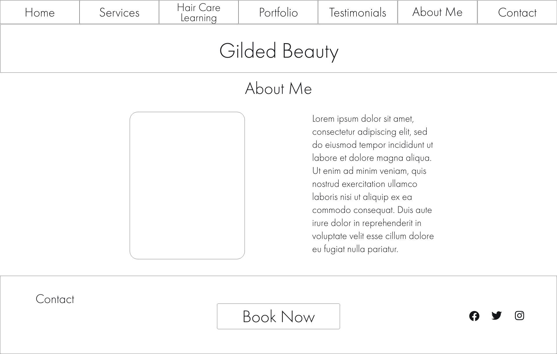
• Mockups
What’s Going On Here
A lot of changes happened to the design as I moved through the phases of design and development. The client said she wanted something austere, something simple, so I omitted the pillars of coily hair I’d planned for in the wireframes.
It was a little challenging getting high fidelity mockups before starting the website development, as the client was busy and was working with a dearth of pictures. As a result, these mockups are a little bare, but the layout would closely match that of the website in the end. However, some sections were taken out for the launch, such as the membership area as well as the clients hair styling portfolio.
Nothing lasts forever, everything changes eventually.



The Final Result
• Final Mockups • Before & Afters
The End of the Road
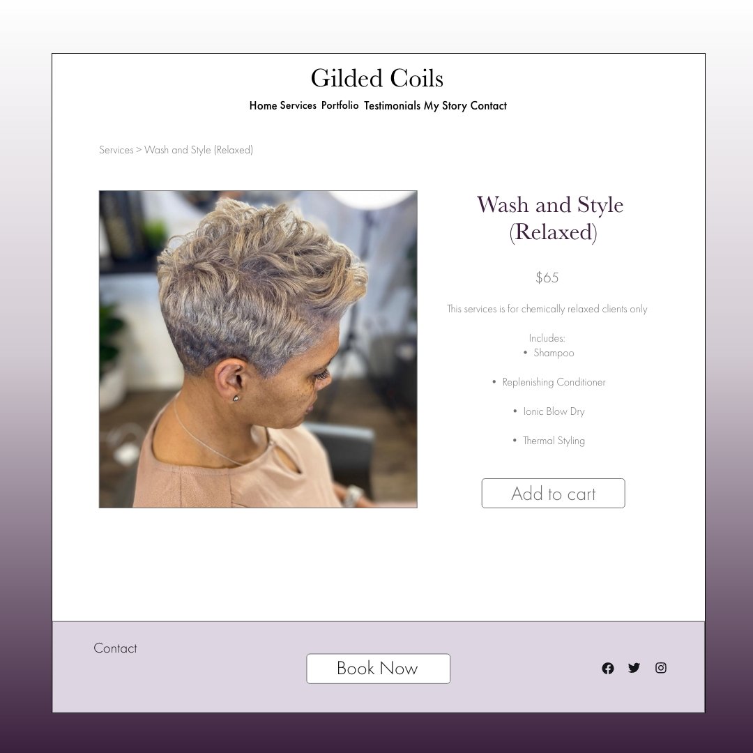
With the pictures in tow, the designs started to come alive, and things started fitting into place easier. These are how the pages look on the website and everything has a minimal and clean aesthetic.



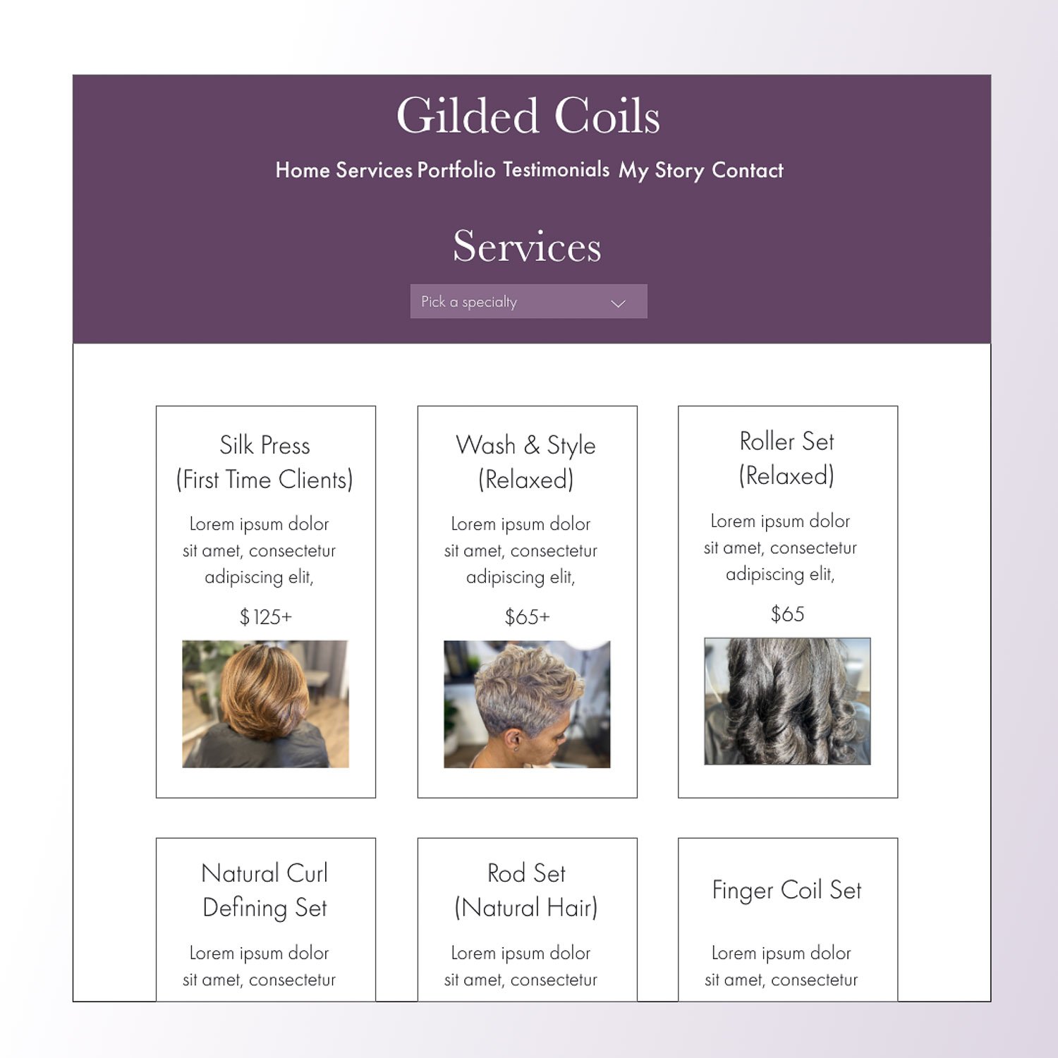
Before & After
Landing page
Services
Contact Me
Moving Forward
• Accessibility Considerations • What I’ve Learned
Accessibility Considerations
Color Contrast
I had to tweak the colors the client wanted to use so that it would pass the WCAG Contrast Checker. The client originally wanted a mix of purples and greys which were difficult to read and I narrowed it down shades of purple.
Page Titled
All pages are titled such that their purpose or subject matter is instantly distinguishable. I made sure that all pages have only one H1 title and that it is as descriptive and relevant to the topic as possible.
What I’ve Learned
This was my first project for a client, and it taught me a lot about how to design and style web pages. I also learned a lot about how a design can, for the most part, get turned completely on its head based on the clients’ reception to the ideas. Through the development of the website, I’ve also learned a lot about SEO practices and this has been a great opportunity for me to expand my skills.
The next steps for this project would be the inclusion of the clients’ portfolio and her membership sections. For now, there isn’t enough content to make those areas as fleshed out as they should be.
