Stefano Tabios
THE LIVING AESTHETIC
Portfolio design and development
April 2022 - December 2022
The Setup
Stefano, a friend from college, came to me about designing and developing his portfolio that he wants to use for his writing and modeling work.
Because he wanted to a large focus to be on his modeling work, I thought that having his landing page be a collage of his pictures would be a good way to set him apart from his peers.
Since this is just a portfolio that the client needed published in a relatively short amount of time, I wasn’t able to do the research I would have liked. Most of the research phase boiled down to a heft competitive analysis to see how other models, photographers and writers had their websites set up.
With helping him set up his branding, he knew what singular font and color he wanted to use, so I found some matching fonts to accompany his selection and potential color palettes. What we settled on was shades of green for his colors, and a sans serif to accompany the Bodoni font he wanted.
Starting The Design
• Paper Wireframes
Setting The Scene
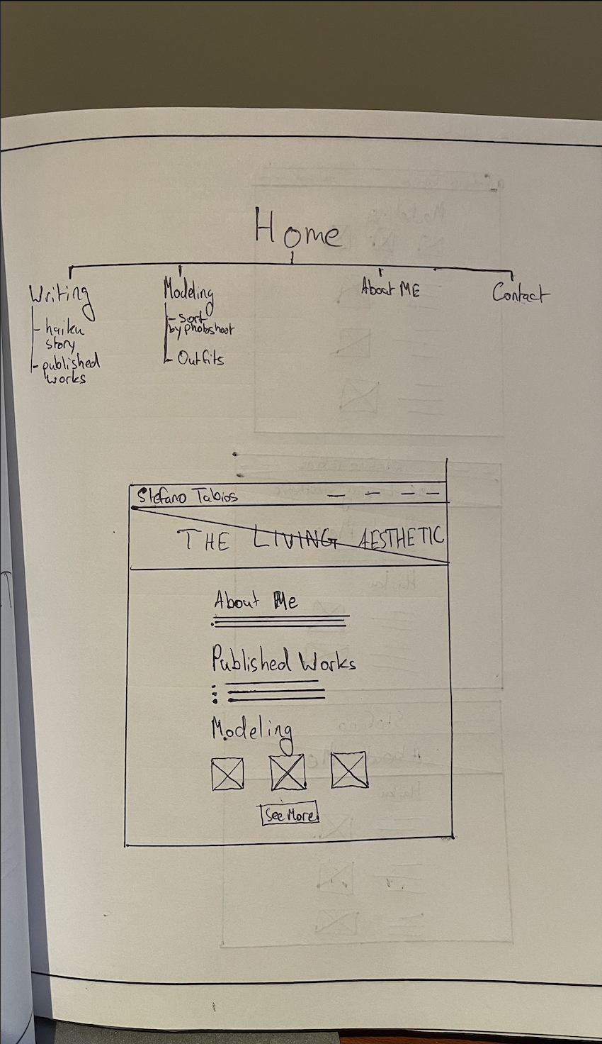
This is the sitemap I had created prior to starting the designs, and my first iteration of what the home page could look like.
At this point, I wasn’t extremely sure on what sections I would want to keep, but I knew I wanted his visual content to play a big part.
These are the other version of the home page that I drew up.
The client noted how he wanted to feature a string of haikus somewhere on the website, so I toyed with the idea of featuring it on the home page, to give his visitors a taste of his capabilities.
In regards to his modeling content, it would take me a while until I landed on a layout I could be proud of.
For his written work, I wanted to highlight any work he’s published or some excerpts, but was told that due to copyrights and other red tape, any published work would be tough to feature.
As for the bottom-most wireframe, I thought it would help Stefano stand out if maybe part of his website looked like a magazine. Unfortunately, I quickly found out that creating that would not look good or be easy to implement.
Refining The Design
• Digital Wireframes
Home Page
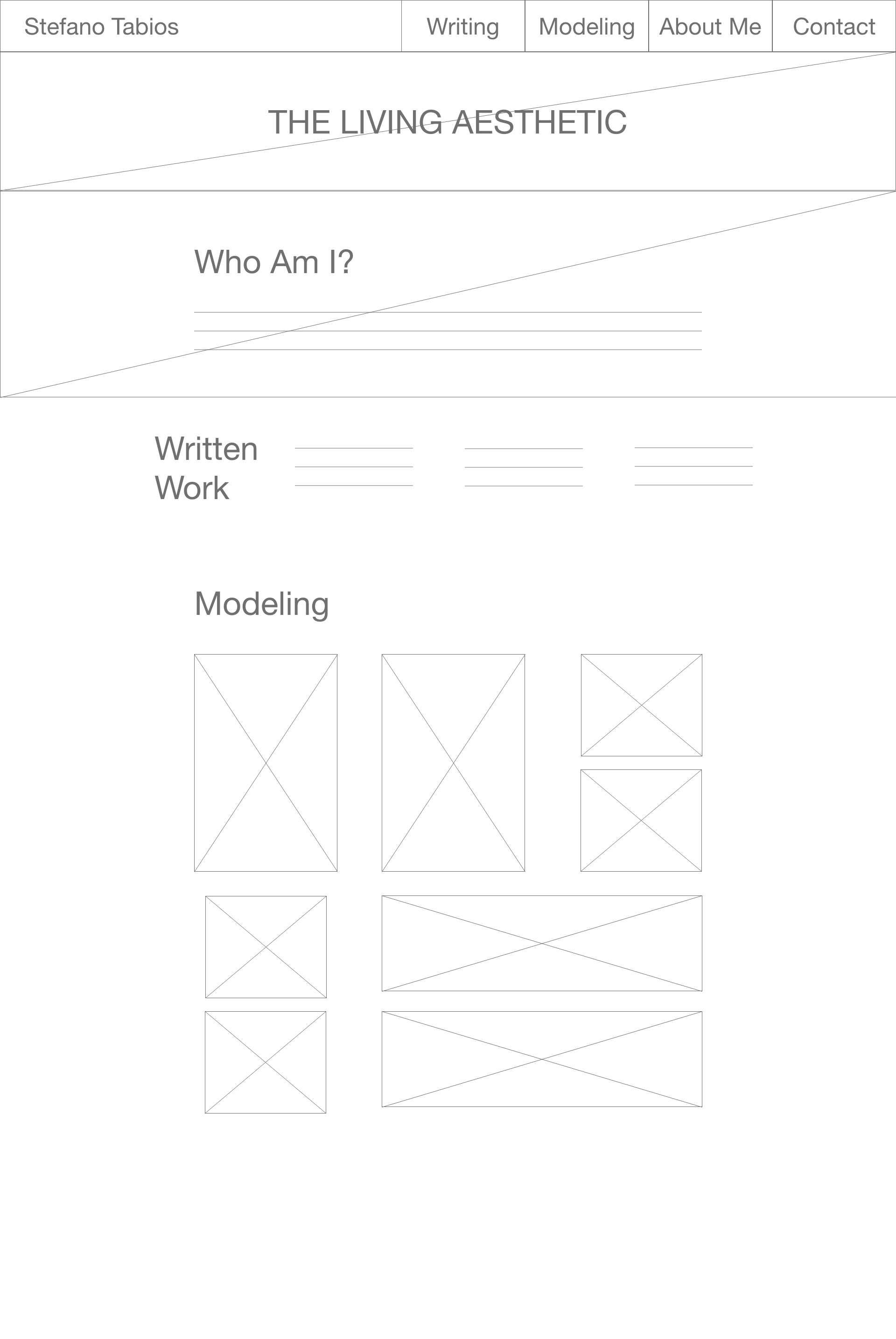
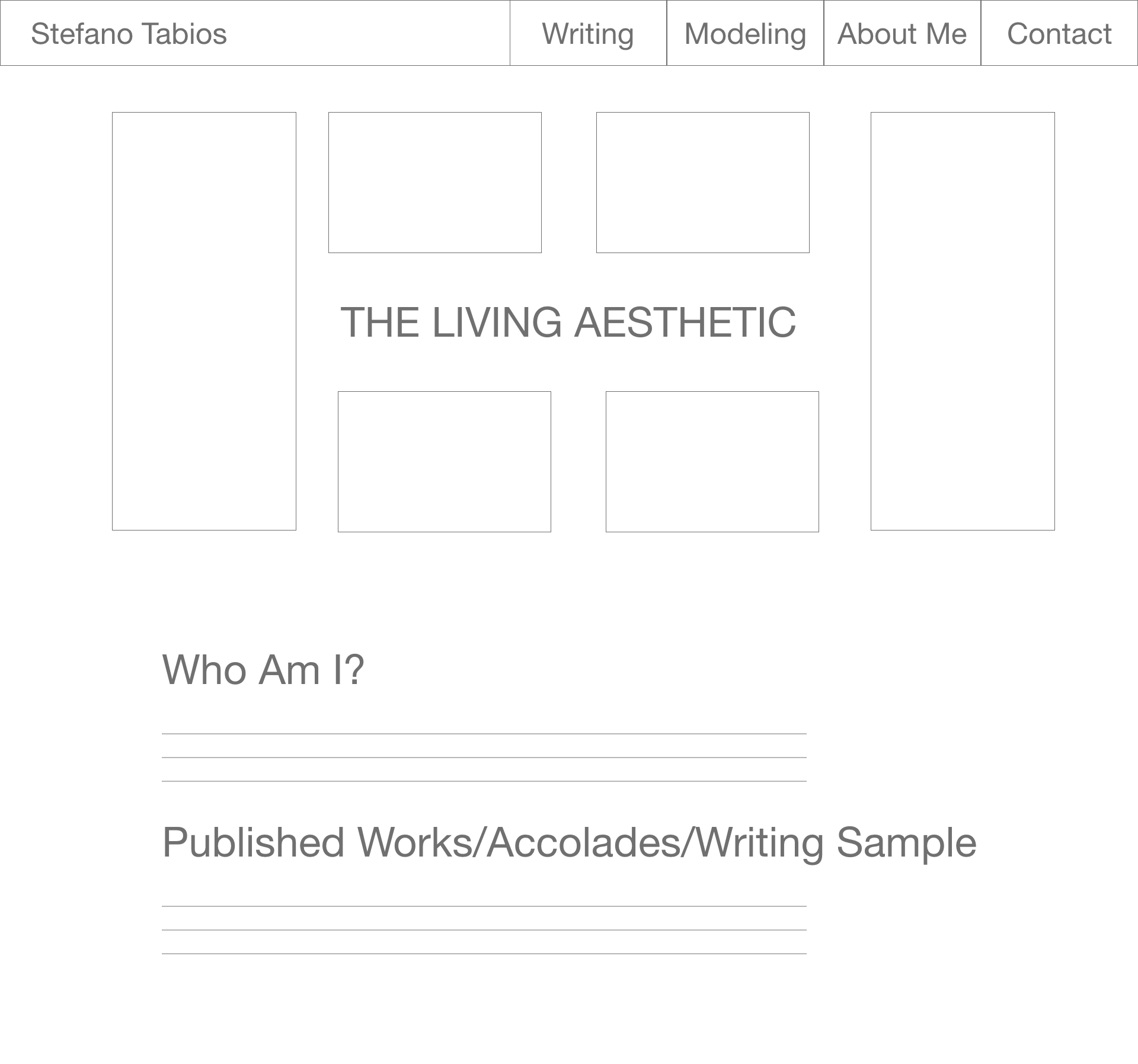
The versions in the middle and left were okay, but felt uninspired. They felt too droll and not reflective at all of Stefanos’ creative genius.
What I finally landed on was the wireframe on the right. His brand name surrounded by photos from his modeling shoots. He and I both loved it immediately, and I was excited to flesh it out when the time came.
Written Work
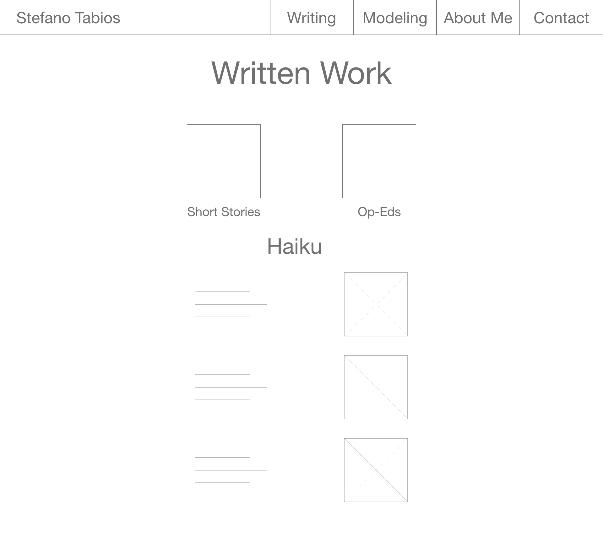
These were the two ways I debated presenting the clients’ written work. On the left, there would be links to his two sections: Short Stories and Op-Eds. The version on the right would utilize an infinite scroll, but upon learning about SEO practices, I decided against this.
Modeling Portfolio
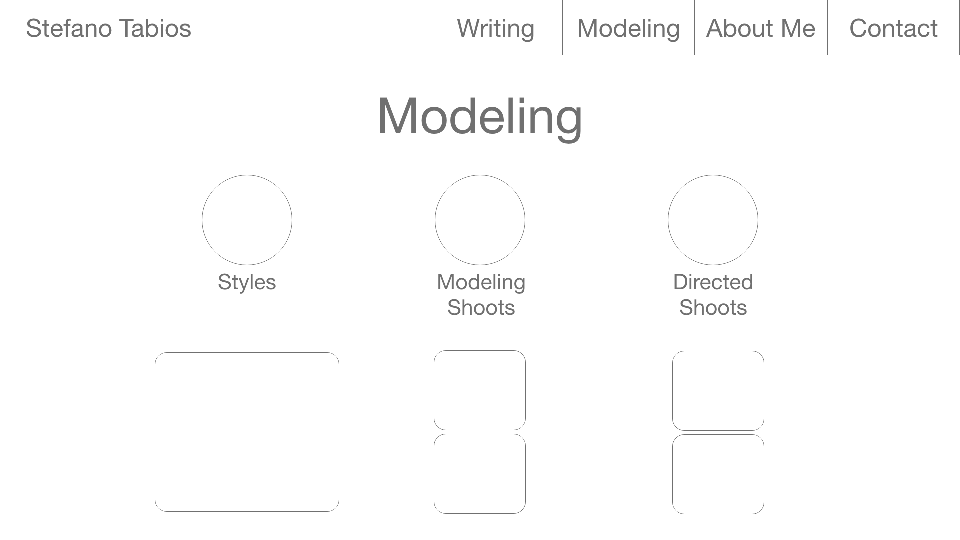
The design for the modeling portfolio felt a little bit more straightforward. The two versions are very similar, just with different placement of the elements.
Biography
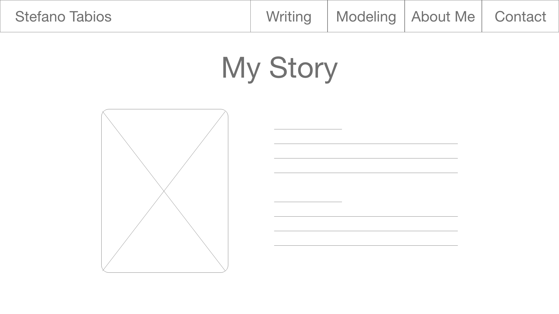
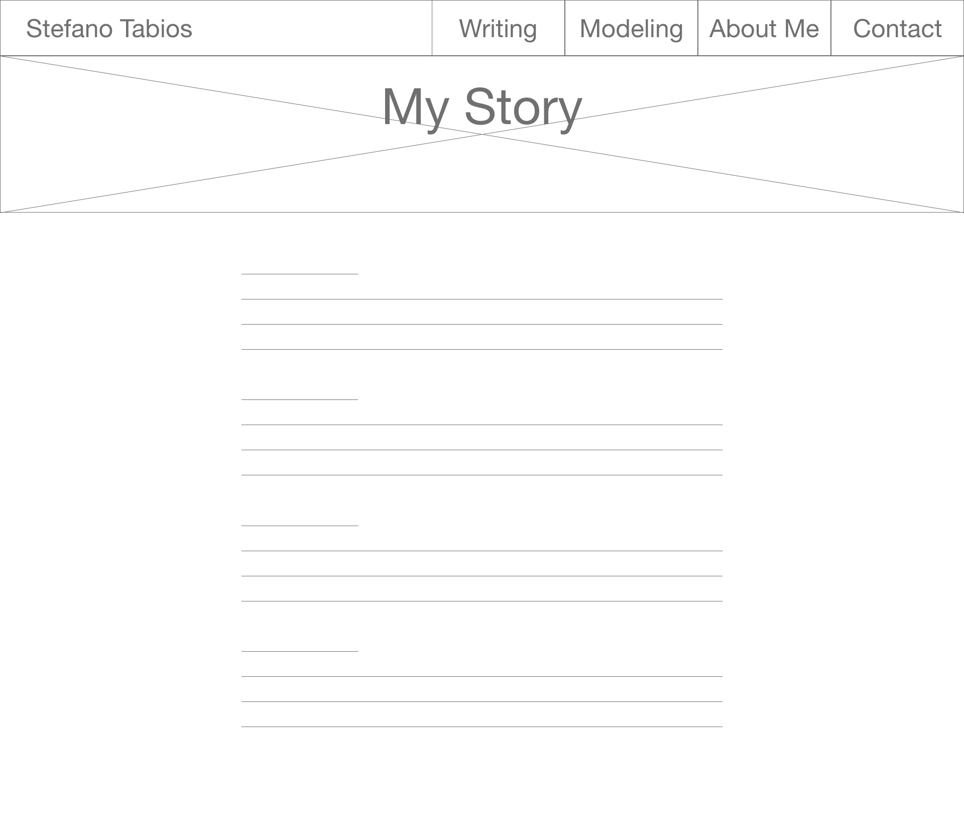
The two versions for the clients’ biography page were very similar, only differing in the placement of the picture.
Footer Options
In the spirit of creativity I considered placing a haiku in the footer, but when I pulled my head out of the clouds I figured that branding would be a better idea.
Finishing The Design
• High Fidelity Mockups
This is the final result of how the website will look. After being supplied with the clients’ pictures, everything started falling into place easier.
It has been a pleasure being able to work with a friend (smoothly) and to get a better view of their talents. Stefano is such an amazingly creative person and talented writer and this has been an incredible experience for helping get my feet wet with this new career.
Afterthoughts
• Accessibility Considerations
Accessibility Considerations
Use of Headings
All pages and sections have clear headings that describe the ensuing content. All pages also only have one H1 tag for improved search engine optimization.
Consistent Components
There is a set style guide for color, fonts and buttons so that things are consistent across sections and pages.
